Editor's Note: Elisabeth Workman gave this presentation at the Asemic Translations event, sponsored by Rain Taxi and held at Minnesota Center for Book Arts on March 25, 2017.
by Elisabeth Workman
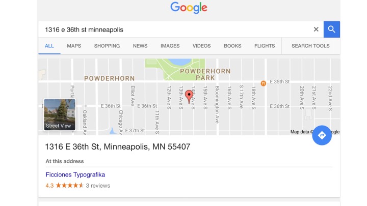
When Eric Lorberer said tonight’s theme was right up my alley I took him quite literally & want to begin tonight, as a way of speaking of the asemic, in an alley in Powderhorn—the 36th Street end of the alley between 13th and 14th avenues south, where I live with the graphic designer Erik Brandt, our creatures, and a mutant, sometimes asemic surface on the side of our garage, visible to pedestrians & eastbound traffic on 36th Street.
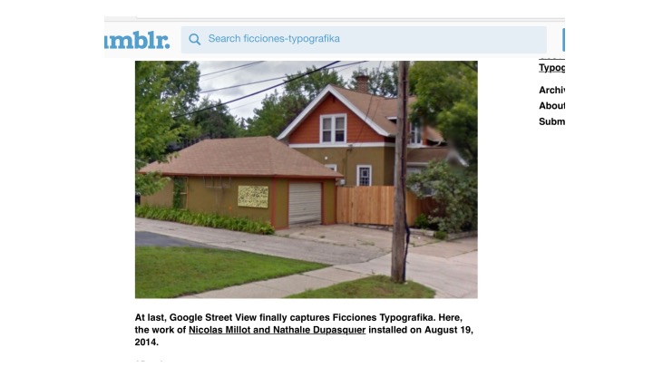
Visible but not always legible. Fictional but not false.
Erik’s project, Ficciones Typografika (the name ½ nod to Borges, ½ extension of his visual communication practice inspired by conglomerate identities, and also the name of a Czech typographic union), began in 2013, with an invitation to artists/designers around the world to submit their own typographical fiction (which has become a very open category for experimental work that’s non-commercial-based).
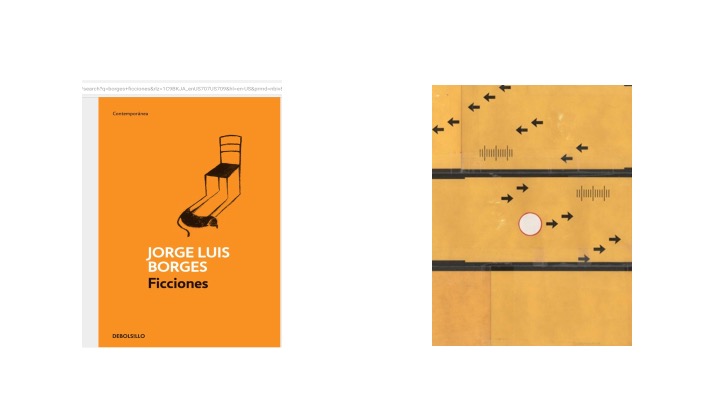
Visible but not always legible. Fictional but not false.
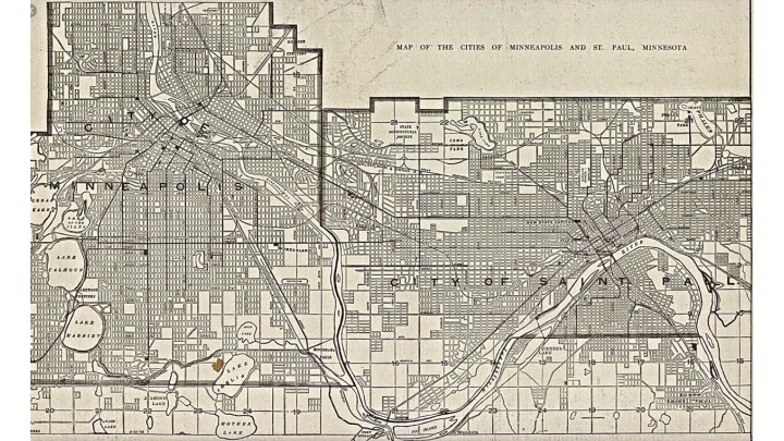
Statecraft insists upon legibility. Tools of legibility include the design of cities, the standardization of language, and the creation of permanent last names.1
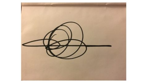
Weirdly signatures are frequently illegible stamps on our ostensible legibility. Though not asemic they are interesting to look at as visual forms. Just as in one signature you might see a spaceship or opera house or flight pattern of a dragonfly in another you might see the rigidity of reductive binary thought or a heart attack or as the poet Nada Gordon has observed: a klan meeting.

Ficciones Typografika has its origins in a design problem Erik assigns to his typography students, in which they deconstruct Letraset forms to create new assemblages that often look like letters but are language-less, speculative typography, if you will.
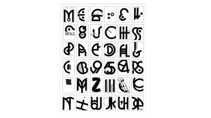
In design pedagogy the prompts are referred to as problems and the outputs solutions. (Imagine creative writing classrooms if we referred to poems as solutions. A simultaneously utopian/dystopian prospect.) What fascinates me about these typographical fictions are the questions and really possibilities that are opened when designers stray and turn their back on capitalism and the state—the solutions are ambiguous, often illegible, even mysterious—they court our capacities for uncertainty, doubt, and difference.
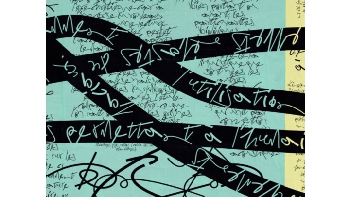
In “The Delusions of Certainty,” Siri Hustvedt writes: “Doubt is fertile because it opens a thinker to foreign thoughts.” 2 Given writings about the asemic that so often include “the reader” in its definition and inspired by the way Hustvedt begins her essay by exploring the mysteries of the placenta (as a temporary mind), I am prompted to think of the asemic encounter as a kind of third mind experience, a transient, nutritive organ between the perceiver and the perceived and just as contingent, in its semantic potential, upon the “written” as the “reader”—the encounter through which we behold an illegibility ripe with possibility.
Visible but not always legible. Fictional but not false.
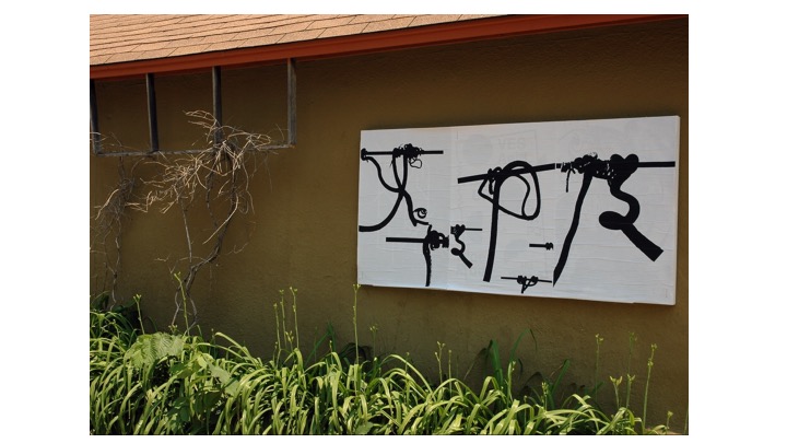
What is the threat of illegibility? That it can’t be controlled? Or marketed? Or branded? Or identified for dehumanizing purposes? While so much of the feedback we have received about this billboard for mystery in our alley has been positive and curious, there is one neighbor critic who we can sometimes hear talking, or rather yelling, back to the posters. Because they are often not in English? Because they are indecipherable? Because implicitly they communicate complexity, difference?
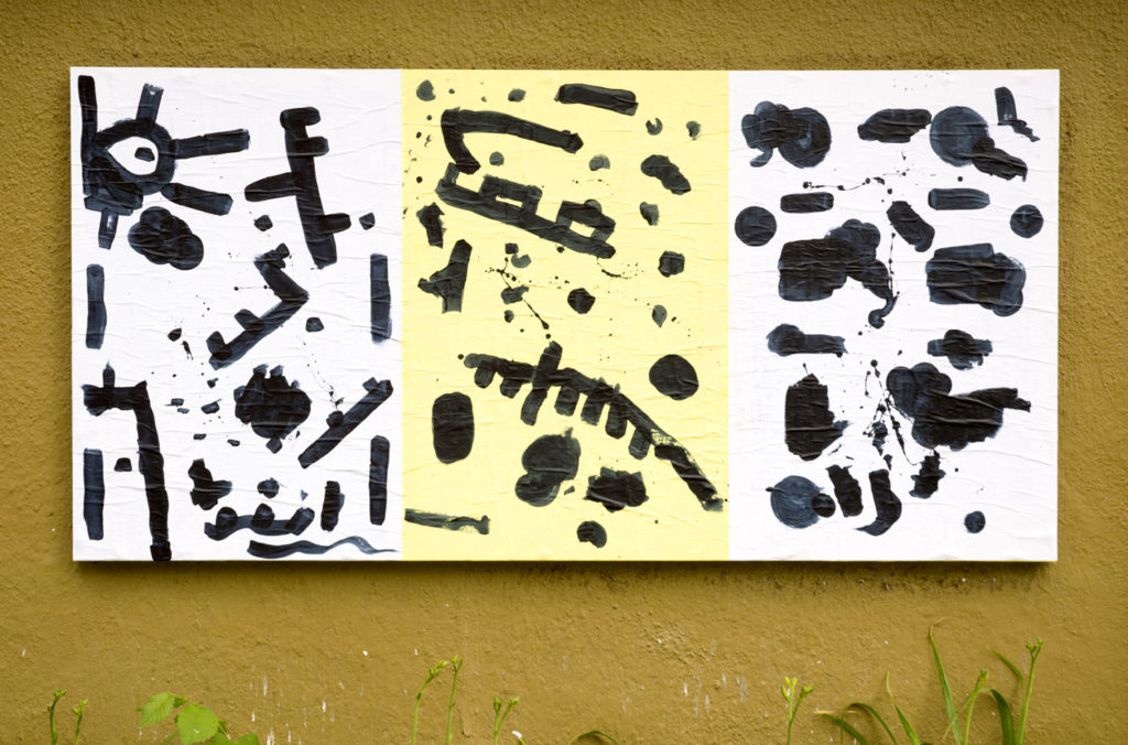
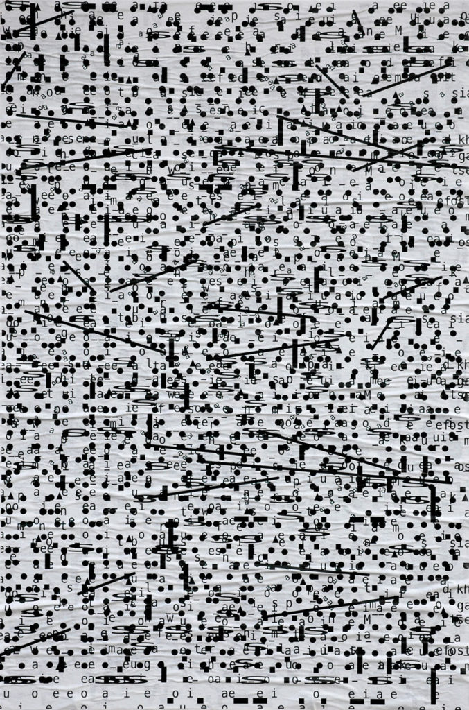
Beatrix Brandt, Ficciones Typografika 907-909 (24" x 36"). Installed on June 28, 2015.
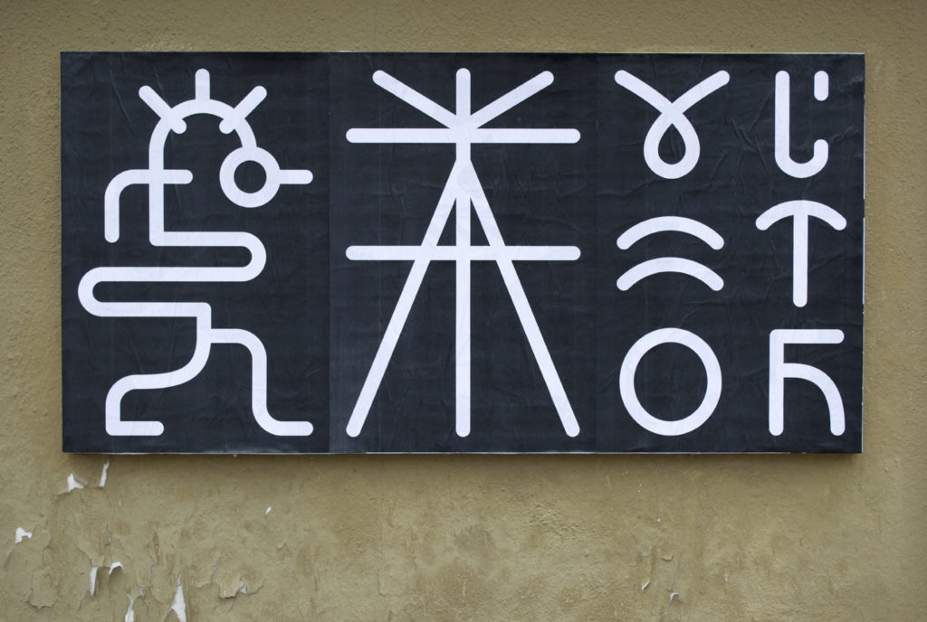
Tobias Textor, Ficciones Typografika 373-375 (24" x 36"). Installed on April 13, 2014.
In Seeing Like a State (which, incidentally I was reminded I wanted to read when I saw it in a neighbor’s free library box a couple blocks from our house) James C Scott observes that “state simplifications [or processes of legibility], the basic givens of modern statecraft, were . . . rather like abridged maps. They did not successfully represent the actual activity of the society they depicted, nor were they intended to; they represented only that slice of it that interested the official observer.” And they weren’t just maps. “Rather,” writes Scott, “they were maps that, when allied with state power, would enable much of the reality they depicted to be remade.” 3 Fast forward to this moment in which we face the implications of an artificial reductive reality of such mapping—red state vs. blue state, “legal” vs. “illegal,” real vs. fake, “normal” vs “other”—in the hands of fascists and how does this sentence end?
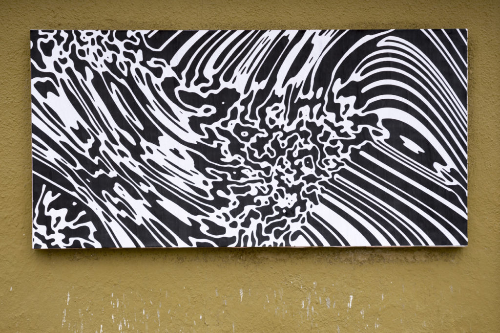
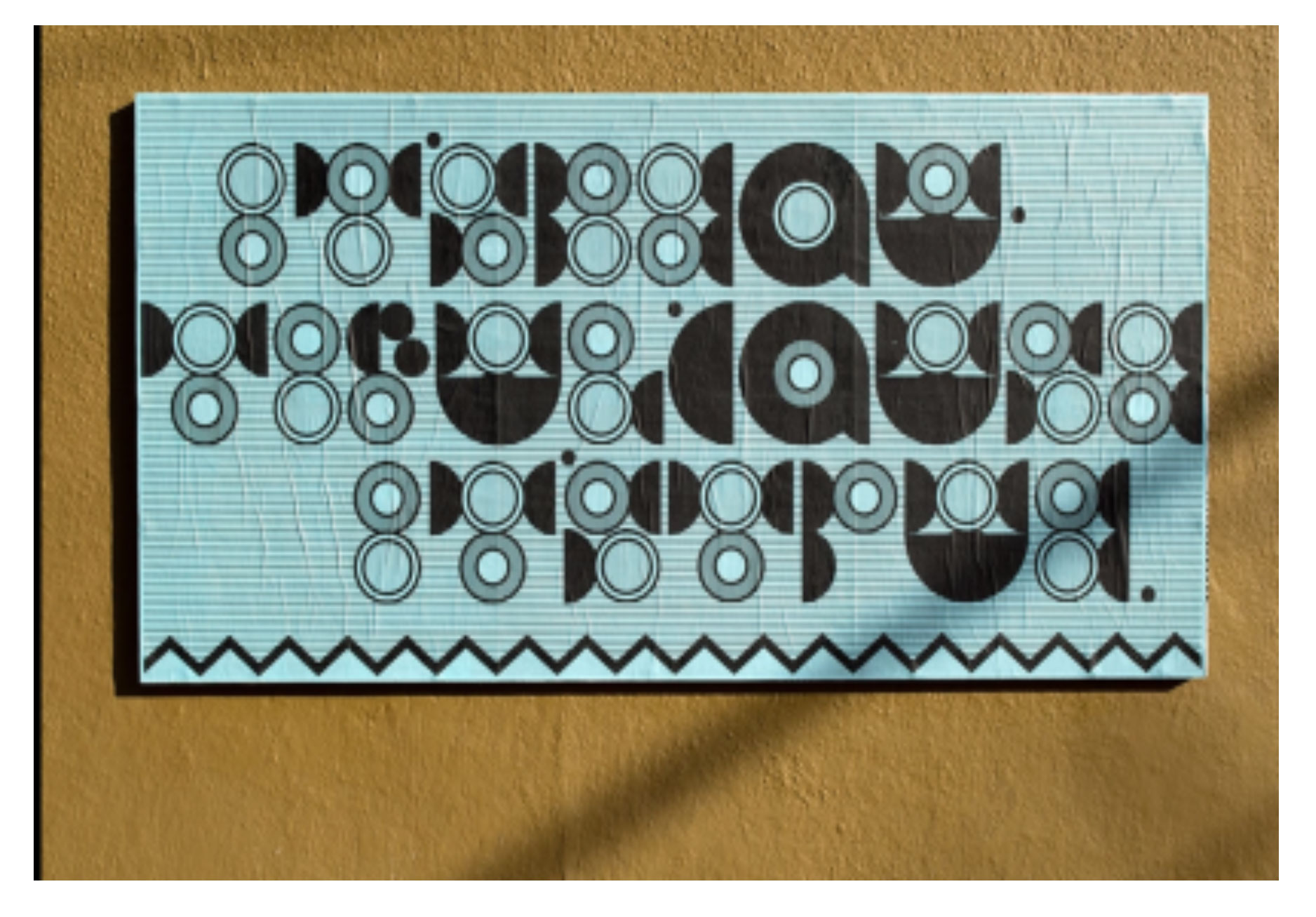
Giandomenico Carpentieri, Ficciones Typografika 1135-1137 (72" x 36"). Installed on March 13, 2016.
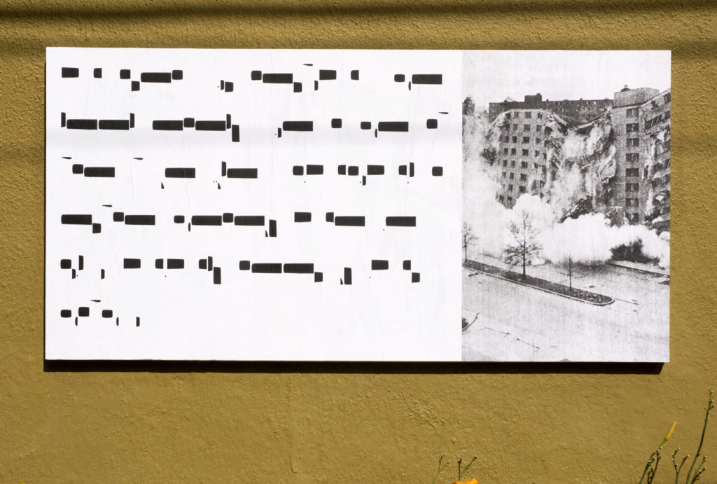
Ines Mena Silva, Ficciones Typografika 1258-1260 (72" x 36"). Installed on July 31, 2016.
What if asemic surfaces were more a part of our dailiness? That we might open the New York Times and behold a full-page spread of asemic print, or drive down the highway and see a billboard emblazoned as such? What if the asemic was more visible. Visible but not legible. In fact in its illegibility, asemic writing is paradoxically radically inclusive, and in its imaginative engagement, fictional but not fake. May this difference—increasingly important—be spreading.
1 Scott, James C. Seeing Like A State: How Certain Schemes to Improve the Human Condition Have Failed. New Haven: Yale University Press, 1998, p. 2.
2 Hustvedt, Siri. A Woman Looking at Men Looking at Women: Essays in Art, Sex, and the Mind. New York: Simon and Schuster, 2016. p 149.
3 Scott, p.3.
Elisabeth Workman is a poet and writer with a background in dance. Her newest publication from Dusie Press is ENDLESSNESS IS NO DESOLATION. Other works include ULTRAMEGAPRAIRIELAND, OPOLIS, ANY RIP A THRESHOLD, and IN THE EVENT OF NOT HAVING AN ANSWER, among others. She teaches at Minneapolis College of Art & Design, where she co-curates the Next Poetix reading series.
